Welcome to a visual journey where creativity meets functionality. Your website is a canvas, and the graphics you choose are the strokes that bring it to life. Eye catching graphics are not just a design element; they are a powerful tool for boosting user engagement and conversion rates, especially in the present age where attention spans are fleeting.
From color palettes that evoke emotions to design principles that enhance user experience, let us turn your website into a masterpiece with this blog.
Understanding the Psychology of Eye Catching Graphics
The term “eye catching” goes beyond mere aesthetics; it encapsulates the ability of a graphic to arrest attention and evoke a response. It involves a sophisticated interplay of colors, shapes, and layout that not only draws the eye but also communicates a message. Studies have shown that users form their first impressions of a website within 50 milliseconds, emphasizing the critical role of immediate visual appeal.
The Impact of Color on Marketing study reveals that color can increase brand recognition by up to 80%. (Source: Loyola Maryland University). The psychology of eye-catching graphics is a fascinating exploration of how visual elements influence human behavior. Colors, for instance, evoke emotions and shape perceptions. Warm tones like red and orange can instill a sense of urgency or passion, while cooler hues like blue and green convey calmness and trust.
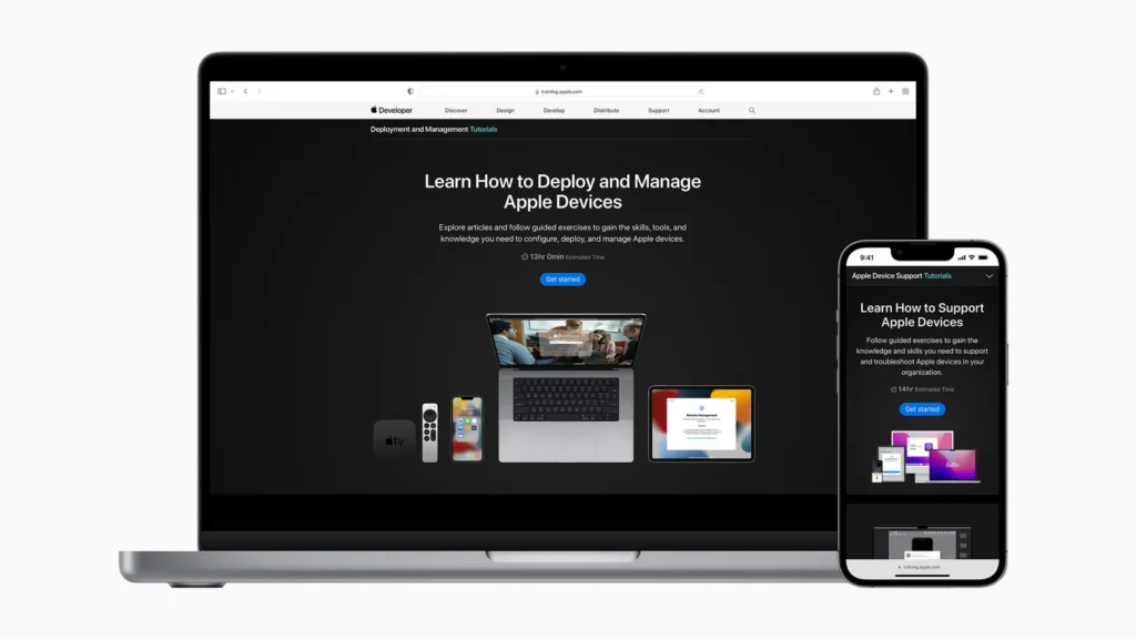
Examining real-world examples of websites with effective graphic design provides tangible insights into the power of visuals. The impact of minimalist design, exemplified by companies like Apple, has been associated with a 43% increase in user engagement.
Tips for an Eye Catching Web Design
In a digital landscape dominated by visuals, the ability to craft eye catching graphics for your website is an invaluable skill. In this section, we will embark on a journey together, exploring the essential elements and techniques that go into creating graphics that captivate and resonate with your audience.
1. Plan Your Design Strategy
- Understanding your target audience is critical. Use analytics tools like Google Analytics for insights into user preferences and behaviors. According to a study by Nielsen Norman Group, 73% of users prefer websites that cater to their needs and preferences.
- Define the purpose and objectives of your graphics to align them with your overall business goals. Brands like Nike effectively convey their mission through strategically designed visuals.
- Competitor research is key to staying ahead. As per a report by Adobe, 89% of marketers emphasize the importance of keeping an eye on competitors for design inspiration. Tools like SEMrush or Ahrefs can help in analyzing competitors’ keywords, traffic sources, and the effectiveness of their visual content.
2. Choose the Right Color Palette
- Colors evoke emotions, impacting user perception. Research from the University of Loyola found that 85% of shoppers place color as a primary reason for product purchase.
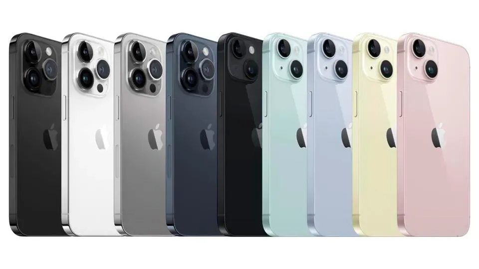
- Apple made a game-changing move by injecting vibrant colors into a previously monotonous market with the introduction of the iMacs. Their bold declaration, “It doesn’t have to be beige,” not only marked a departure from the ordinary but also breathed new life into a brand that had faced staggering losses of $1.8 billion over two years. The success of the iMacs laid the foundation for Apple’s ongoing exploration of color, evident in subsequent new color releases for each year’s Apple devices.
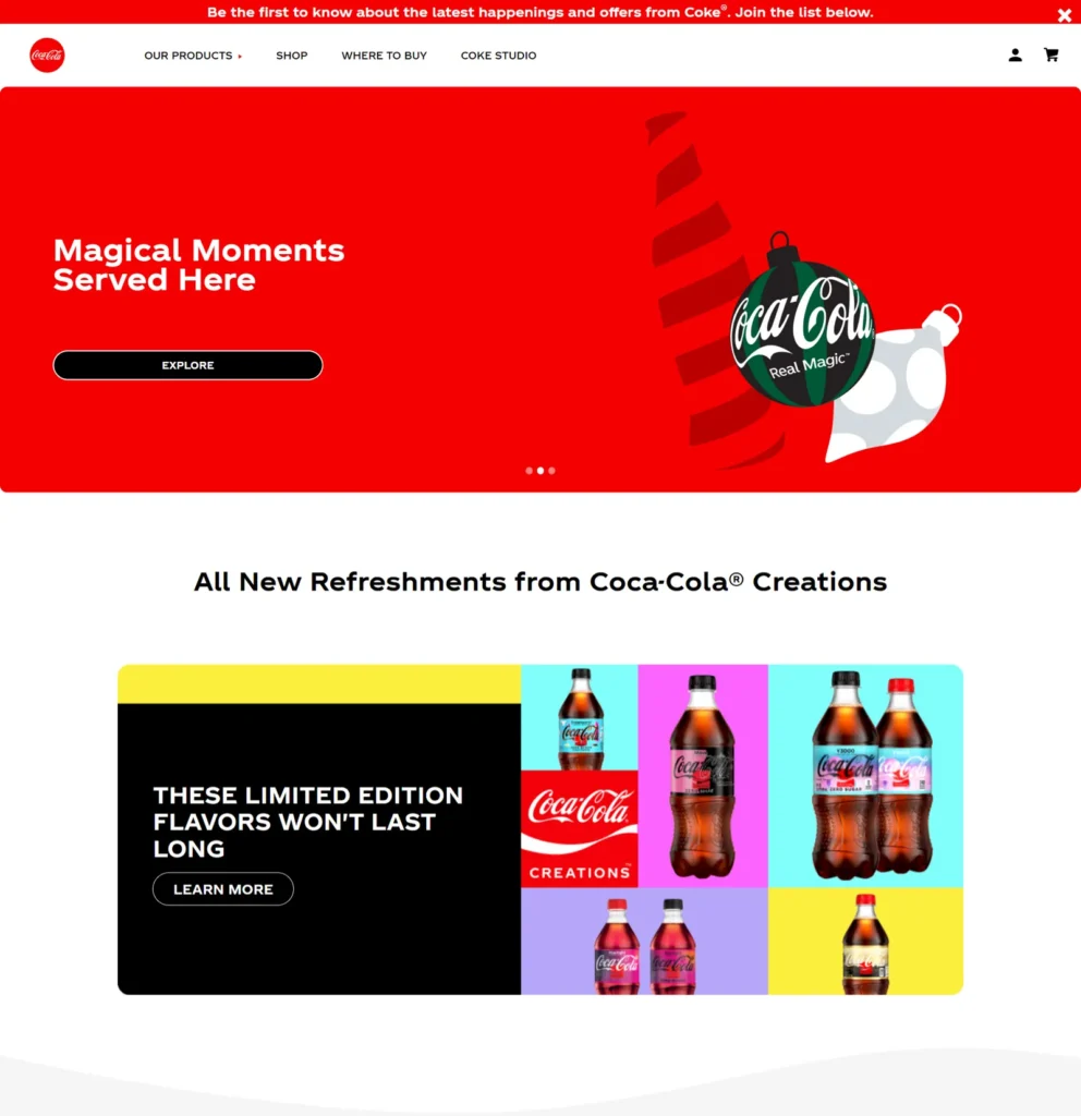
- Warm colors like red can stimulate urgency, a tactic frequently used by brands like Coca-Cola in their advertising.
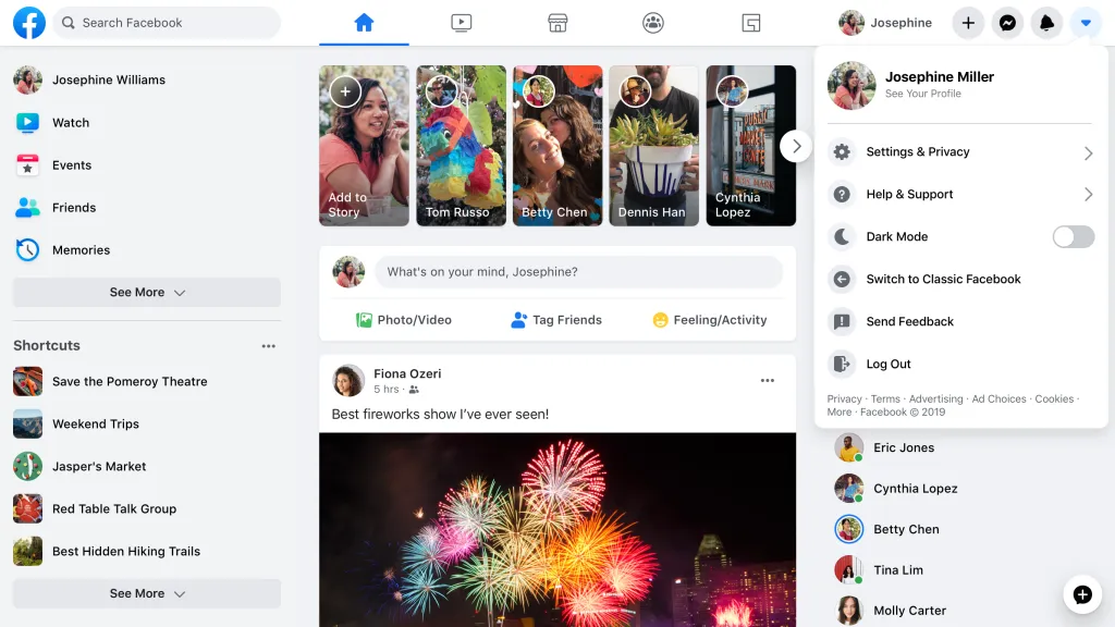
- Cool tones like blue and white convey trust. Social media platforms like Facebook use blue to create a sense of reliability.
- Selecting a color palette that aligns with your brand identity and appeals to your target audience is a strategic move that can significantly impact user perception.
3. Typography and Visual Hierarchy
- Typography is the silent communicator on your website. Fonts play a crucial role in brand communication. A study by MIT revealed that font choice affects readers’ trust and comprehension.
- Strategic font choices guide users through content. Apple’s use of the sleek San Francisco font aligns with its modern and minimalist brand identity.
- Establishing a visual hierarchy improves readability. Amazon strategically uses font size and style to prioritize information, enhancing the user experience.
4. Incorporate Imagery and Illustrations
- High-quality images are the soul of visually stunning websites. Beyond merely being aesthetically pleasing, images enhance the overall user experience.
- According to Google, 53% of users abandon a site if it takes more than 3 seconds to load images.
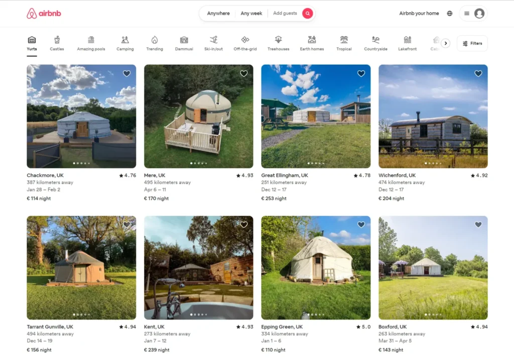
- Align visuals with brand personality. Airbnb’s use of authentic, localized images reinforces its commitment to providing unique travel experiences.
- Additionally, the strategic use of illustrations and icons can add a layer of visual interest, making your website more engaging and memorable. Slack‘s use of custom illustrations humanizes its brand and simplifies complex concepts.
5. Use Layout and Negative Space
- A well-structured layout improves user engagement. Eye-tracking studies, such as those conducted by Nielsen Norman Group, show that users follow an ‘F’ pattern when scanning web pages.
- Balancing content and white space is crucial. Google’s homepage exemplifies the effective use of negative space, focusing attention on the search bar and buttons.
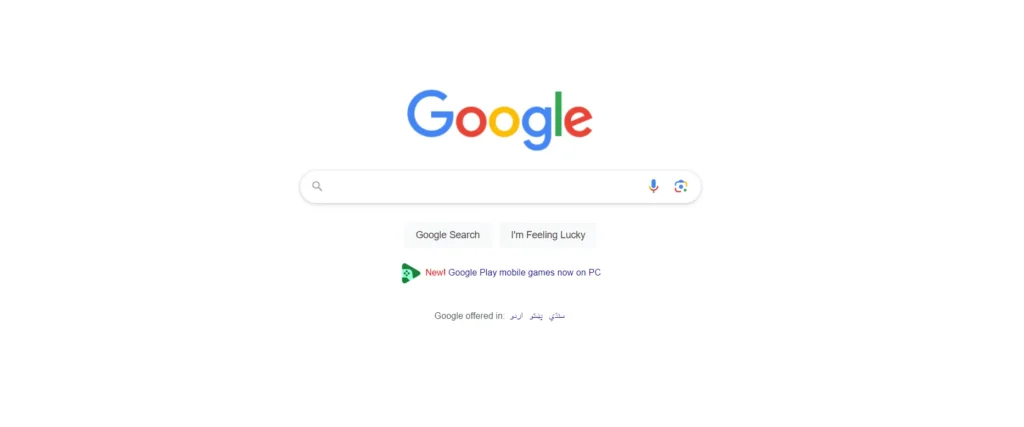
- Utilizing negative space directs attention. The Apple website employs generous negative space, creating a clean and uncluttered design that emphasizes product features.
6. Optimize Graphics for Web
- No matter how stunning your graphics are, they must load swiftly to ensure a positive user experience. Google’s PageSpeed Insights reveals that a 1-second delay in page load time can result in a 7% reduction in conversions.
- Choosing appropriate file formats is essential. JPEGs are ideal for photographs, while PNGs are suitable for graphics with transparency.
- Responsive design is non-negotiable. Starbucks’ website seamlessly adapts its graphics for various devices, ensuring a consistent brand experience.
7. Test and Iterate
- User feedback is a goldmine of insights that can guide you in refining your design strategy. A study by Qualtrics found that 86% of consumers are willing to pay more for a better customer experience.
- Conducting user tests, gathering feedback, and making continuous improvements based on real-world data ensure that your website graphics are always evolving to meet the ever-changing expectations of your audience.
- Continuous improvement is the key to meeting user expectations. Amazon’s iterative approach to design involves constant testing and optimization, ensuring a seamless shopping experience.
8. Design for Mobile Responsiveness
- Mobile browsing has become the norm, with over 50% of global internet usage on mobile devices. Responsive design is crucial for providing a consistent user experience across devices.
- Visual integrity and functionality must be maintained on various screen sizes. Google’s mobile-first indexing emphasizes the need for optimized mobile experiences.
- A seamless transition between devices enhances accessibility and user satisfaction.
- Brands like Spotify and Amazon excel in offering a consistent and enjoyable mobile experience.
Related Article:
How Businesses Can Use AI Content Strategy
Top 5 Tools and Resources for Graphic Design
1. Adobe Creative Cloud
- Purpose: A comprehensive suite of industry-standard design tools.
- Key Features: Photoshop for image editing, Illustrator for vector graphics, InDesign for layouts, and more.
2. Canva
- Purpose: Canva is a user-friendly online platform for quick and easy graphic design.
- Key Features: Templates for social media, presentations, posters, and a drag-and-drop interface.
3. Figma
- Purpose: Collaborative design tool for creating user interfaces and interactive prototypes.
- Key Features: Real-time collaboration, vector editing, and a versatile design environment.
4. Unsplash and Pexels
- Purpose: High-quality, royalty-free images for your designs.
- Key Features: A vast library of photos to enhance your visual projects.
5. Google Fonts
- Purpose: A collection of free, open-source fonts for web design.
- Key Features: Easily accessible and customizable fonts for diverse design needs.
Wrap-Up: Your Gateway to Eye Catching Graphics for Website Design
First impressions are everything; the significance of eye catching graphics cannot be overstated. As we journey through the intricacies of graphic design, let us reflect on the profound impact it has beyond mere aesthetics. Crafting visuals that resonate with your audience is a continuous process of evolution. By implementing the tips shared in this guide, you not only enhance user engagement and conversion rates but also set the stage for a website that leaves a lasting imprint. So, take these insights, infuse your creativity, and watch as your website transforms into a captivating digital experience.
The Tech Junction is the ultimate hub for all things technology. Whether you’re a tech enthusiast or simply curious about the ever-evolving world of technology, this is your go-to portal.

